Now, to get the proverbial ball rolling as it where. I was feeling quite good about my storyboard but a rather lukewarm reaction from people I have shown it to has lead me to have a bit of a re-think. Granted, these weren’t animation people but I still think it highlights an issue. I am hoping that its just a problem with clarity, as the same people seemed to like the script, of course if its an issue with the actual storey I can make the odd tweak but if the basic concept is flawed then I am more or less screwed.
Anyway, to try and sort the techy stuff I have read Don Bluth’s The Art of the Storyboard to try and iron out little problems and make the storey ‘flow’. The book had some very good pointers about layout, lighting etc. Stuff I had already tried to take into account but not necessarily executed in the right manner so it will probably be beneficial for me to redo quite a lot of it in the next week or so. To get that started, right here, right now, I am going to attempt to go through the entire thing and justify everything I have done, and chuck anything I can’t. “Trim The Fat!” as Mr. Bluth would say.
Here we go then:
The main characters are:
The mites: the ‘creatures’ I referred to in my last blog
Cheveu: the main mite
Leurre: The piper
For the entire film I want to shoot with a filter over the lens which creates a sort of looking through a key-hole type effect, inspired by an old bit of A-level work I found lying about. I also want to use a ridiculously small depth of field and perhaps a fish-eye effect to make everything really claustrophobic and disorientating – like the Quays. Oh yeah, the whole thing might also be in black and white.
Shot 1: I’m not quite sure why but at some point over the summer I decided it would be a good idea to include some sort of mechanical device in the animation and promptly set about studying the innards of a clock. I guess I just like all the cogs and stuff. Out of everything I have done I am most unsure about this and don’t really know if it is necessary or not. I can justify it in a roundabout kind of way, in that it is my interpretation of a theory of Wilhelm Fliess, who cropped up in my dissertation research, which based around the idea that the world is based on rhythms of numbers.
Taking further inspiration from the Dadaists Francis Picabia and Johannes Baader who produced artwork inspired by machines and the like I arrived at the conclusion that Fliess’ theory could be represented as a machine. And what machine deals with numbers? A clock. I have dubbed my clock The Entrelacer. The rhythm of the clock also syncs up nicely with the scratch track and could be used to dictate the beats of the animation.
So we start out with this shot of the The Entrelacer – if this is cut I may keep the ticking in the soundtrack, as a more subliminal thing – but I do like the look of the clock and how it is nicely divided up into sections. Anyway we then pan up through the clock to a shot of the street, Poussièr, where the story takes place. I am a bit worried that the street is not recognizable as a street but I quite like the idea of the characters moving through an abstract space.
I envisage animating the clock in 2-D, by hand, or dare I say it, on Maya (obviously some 2nd year lackey would deal with it if that where the case). In post this would then be comped onto the street which would be a stop-mo set, essentially creating one big picture that you could move a virtual camera over in after-effects or something.
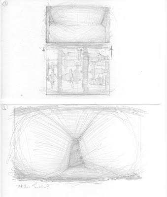
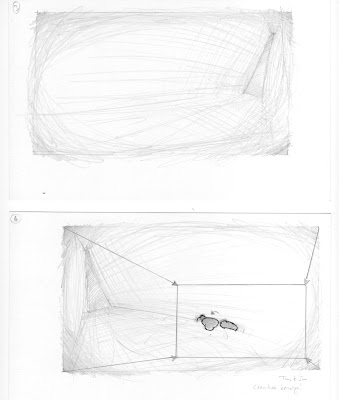
Shot 2, 3 & 4: Along with the previous shot of Poussièr these shots create a montage which serves to set-up the scene – an idea used in lots of films but I particularly noticed it in Che: Part 2 where the same technique is used to establish a lot of the camp scenes. During these shots I thought I could mess about with the focus playing with areas of interest, just to art it up a notch. Another idea that came to me on a whim was to have the transition between these scenes work like a slide projector; with the image sliding off, black, then the new image sliding in. I’m not really sure what this would add to proceedings, it might not be worth the hassle to work out how to achieve something which may just confuse the audience. A fade in and out between each shot might work better. Shot 4 ends with the Mites emerging and a slow truck in. This might be a right pain to do in stop-mo so I may just use a sequence of different shots, which gradually get closer to the action. If properly executed this should achieve a similar effect.
Shot 5: Here we see more of the mites emerging. In this shot and all of the ones featuring the mites I want to use quite low camera angle, to show their perspective. Actually I think this shot doesn’t work that well and would be better shot from the right, looking left. Or it may work quite well if I got rid of this shot and replaced it with what you end up with after the truck-in on shot 4.
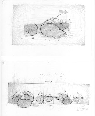
Shot 6: I really like this shot, which pans with one of the mites as he moves through all the other mites. He moves left to right to put the viewer at ease, the whole aim of this shot is to identify the mites as cute fluffy animals. I am slightly worried that this upsets the flow and therefore might work better as a montage, with the same character moving through the foreground in each to keep continuity.
Shot 7: My initial idea for this shot was to have the mites in the foreground Leurre to slowly come into view in the background. However, if I where to turn shot 6 into a montage I would use this as the final shot with the character that is followed throughout coming into the foreground. I’m not sure if I want to shift the focus from the foreground to the background as this may show Leurre too clearly and I want her to remain quite ambiguous at this stage.
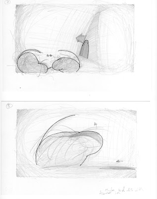
Shot 8: This is a reaction shot of one of the mites to Leurre, showing her presence with a looming shadow. Originally I was going to shoot this over Leurre’s shoulder but that would show her perspective of events, which I don’t want to do at this stage. This shot is a bit bland though so I might have the reaction in shot 7 or start the reaction there and finish it off on this shot with maybe a bit more of a three-quarter view.
Shot 9: Another shot that I quite like, although to keep continuity it might benefit from being shot at a lower level.
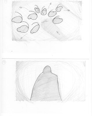
Shot 10, 11, 12 & 13: The first time we see Leurre clearly is when the mites do, so it is fitting that it is from there POV. We then go back to the mites, recycling the angle from shot 5. By only using these two shots throughout the exchange I hope to build some tension, I would like to think that it works but I’m not quite sure why.
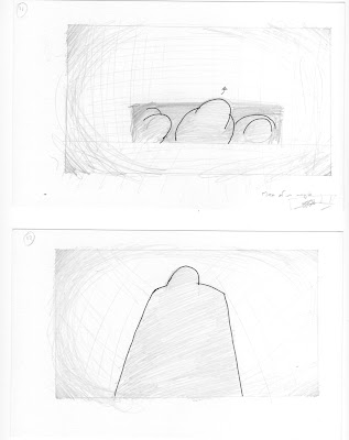
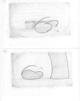
Shot 14, 15, 15b & 16a: Again this repetition of shots continues except I change the shots of the mites to show Cheveu investigating Leurre. I think this all works o.k. but shot 14 and 15b would benefit from more of a three-quarter view, just to make them look a bit more interesting.
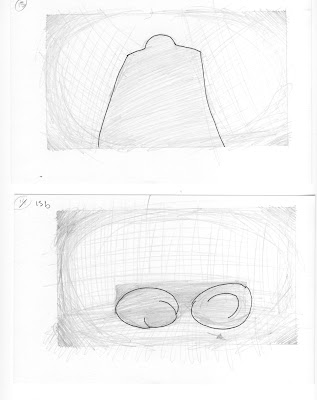
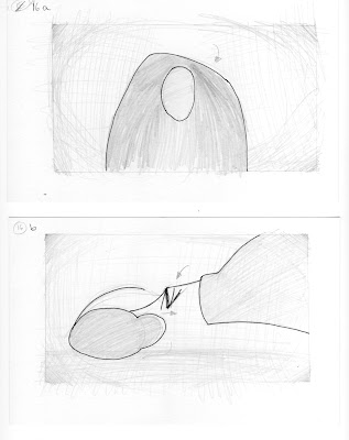 Shot 16b & 17: I’m in two minds about these two shots: I can’t decide if I want to keep them as is or shoot everything into shot 17. I’m happier with the higher angle on 17 because we have now seen Leurre properly but in terms of shot economy it might be better to shoot it from the same angle as 9.
Shot 18: Now Leurre starts to get proper scary, to intensify the scene I want to include a light source behind – an idea stolen from A Clockwork Orange – and tilt the camera a tad, I know I went a bit overkill with this on the Robots project but I was watching Doubt the other night and quite liked how increasingly extreme tilts where used to build tension, so I’m going to nab that idea too.
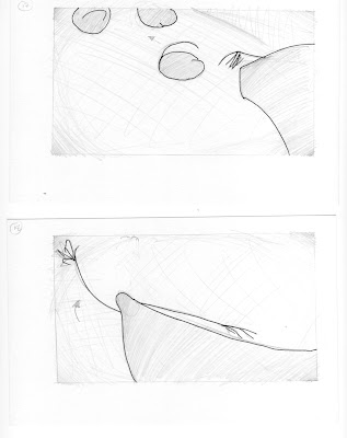
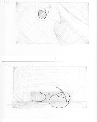 Shot 19: I really want to exaggerate things on this shot – nice long shadows and a high angle to make Cheveu look really insignificant, the shadow of Leurre’s hand should be roughly where Cheveu is, as if its grabbing him. I’m not sure if I should include Leurre in shot.
Shot 20: Lower angle to show perspective of mites, definitely needs to be shot from right looking left or maybe a POV shot of mites in hiding showing Cheveu running from Leurre would be better, it also leads into shot 21 nicely.
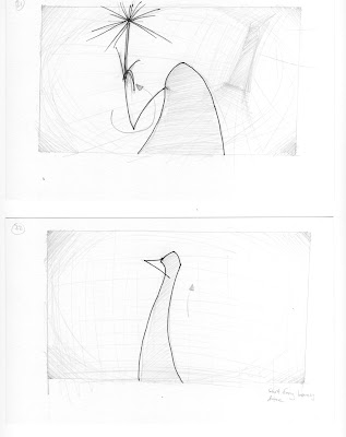 Shot 21: Eye level shot to ease tension slightly, but maybe keep tilt (were not out of the woods yet) would be really good to get a shine off the flute. Would be better as a full body shot to lead into 22.
Shot 22: Nice set piece for Leurre’s dance, nice and simple in terms of camera stuff but an arse to animate.
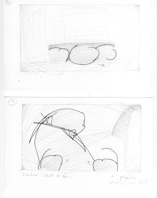 Shot 23: Again, would benefit from being shot from right looking left or including Leurre, like in the alternative to 20 as this would flow better.
Shot 24: I want to shoot this from the mites perspective but I don’t want Leurre to seem to threatening, so I might keep the camera quite far away.
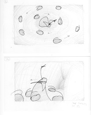 Shot 25: I want to show the weird little dance that the mites do in one go, and I figured the best way to do this would be an ariel shot, this also provides a clear cut between the different parts of the story because it is so different from the other shots I have used. I suppose the best way to do this would be to somehow get a rostrum on the stop-mo set and mount the camera on that.
Shot 26: Same as 24, might use a lower angle to make it look more dynamic, or get a full body shot. Leurre should exit left to maintain flow.
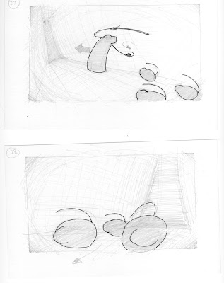 Shot 27: Leurre enters right, folloed by mites. Again, a lower camera angle might work.
Shot 28: Don’t really need this shot, so will cut it.
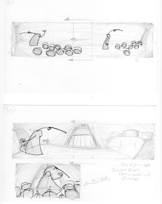 Shot 29 & 30: I like these shots a lot; I want to fade into black at the end of 29 and fade out on 30 to provide a clear cut but its quite nice that the movement keeps the flow and provides an interesting comparison between the two sets. It would be a lot to animate in one go so a montage may be better, then again I am getting a bit montage happy.
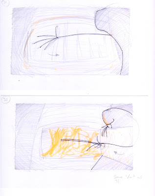 Shot 31 & 32: Its very important that Leurre is on the right of the screen as this will increase the tension, a lower camera angle may also be beneficial. I will also mention that I want the fire to be the main or maybe even only source of color in the film. I’m not quite sure how to do this, I’m sure there is a way to do it in after-effects or something though. As for animating the fire I thought I could probably have a light behind the set, shining through the hole in the oven, then by altering the light intensity between frames I could make it look like it was flickering.
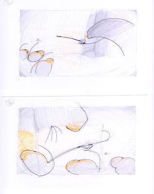 Shot 33: I was worried about crossing the line of action (or whatever its called) on this shot, so I got as close as I dared. However, I think I could actually get away with it and just shift the camera slightly to the right to get a nice profile shot of Leurre. This may bugger-up the next shot but we shall see.
Shot 34: Another shot I quite like, inspired by the teacher character from Pink Floyd’s The Wall. One problem, however, is that Leurre is on the left, when ideally I want her on the right, unfortunately I cant flip the shot due to continuity but I could exaggerate her leer so that she bends round from the right.
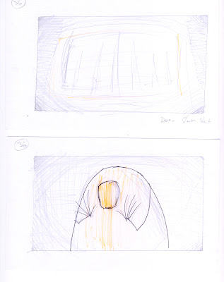 Shot 35: Nice simple shot; door to oven slams shut, fade to black.
Shot 36: I’m not sure if I want to include this shot or not – it does provide Leurre with a bit of a purpose but I think it might be a bit cheesy. If I where to use it I thing I would use a long shot from behind instead.