Friday, 25 June 2010

Its been awhile

So much for updating this on a week by week bases eh? It has been a long long time, too long in-fact, so lets have a catch-up. So much has happened, my graduation film is done and dusted, now named Tooty Fluety. I am currently in the process of prepping this for various festivals so for the time being it is staying of of the internet, if it looks like I will not be able to post it I will put together a trailer or something which gives the general gist of things.
Complete with business cards and website (check it out it is very pretty) I have also been unleashed upon the unsuspecting animation industry, as of yet I have no concrete offers for any work, its all ifs and buts but I am hoping the London screening of the gradation films will present some opportunities.
In the meantime, to keep myself busy, and off the dole, I am embarking on a couple of projects. The first of these is my own solo project about a duo of assassins. The whole assassin thing serves as a backdrop to the main story which focuses on one of the pair and his struggle with his sexuality and bipolar disorder. The idea that he starts of as a suave gun-toting homosexual and gradually becomes increasingly unpredictable as the bipolar takes hold and he falls head over heals with his accomplice, who happens to be a girl. So far I have just about got the design down for this hitman bloke, yet to be named. He does look a little like my Jesus character, but i can live with that.
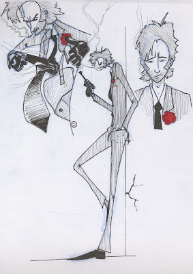
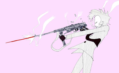
I have tried to work in a lot of the exaggeration I experimented with in life-drawing, so he is quite lanky, which I quite like. In the first set of sketches I was finally starting to get a look down, after a lot of trail and error. I i am hoping that the vertical lines on his body will make make him seen even taller. Most of the pink picture was done in Photoshop, the gun is a tad big and the bottom of the suet bothers me but if I use this concept in the final piece that can be changed.
I am toying with the idea of setting the whole thing in the 60's as the character was influenced quite a lot by Sean Connery's portrayal of James Bond and I have access to a lot of books with pictures of crazy WWII weapons in, the sort of thing which would have been available on the black market at the time. There was also quite a lot going on in the world at this time which I could weave into the story; Cuba, assassination of JFK, fugitive Nazis, the IRA, the civil rights movement, Vietnam, we won the world cup, paranoia over Russia and a world-wide Communist Conspiracy, all kinds of stuff. If I do do this he may get a bit of a 60's makeover, we shall see.

Tuesday, 11 May 2010

Manic

Manic, manic, manic! Quite possibly the only word which can be used to describe the past couple of weeks most definitely what is to come. As of yesterday all the stop-motion is done on Ben?s project, towards the end I was also doing the animation since Ralph was busy doing his rough-cut. I mainly ended up doing the lip-sync scenes which were a tad challenging since I hadn't had the luxury of being able to do any tests so I was acquainting my-self with the character on the fly. The early scenes I shot are a bit ropey but I quickly got used to Helvis and came to discover that slight, understated movements where a lot more effective.

On my project Jake has started to put some sound together, which has had an unbelievable effect on the animation and has really perked it up and help tie the story together. I have currently got two edits on the go, one which is pretty close to the last rough edit and another which is a sort of hybrid of various ideas from Andy and Georg where the piper appears right at the beginning and lures the creatures out of hiding. I was favoring this new edit but now I have seen the old one with sound I?m veering back towards that one again ? this is starting to look like a repeat of my pre-production dilemma so I need to make a decision ASAP and stick with it. In the meantime I plan to be making it all look pretty in Photoshop.

In other news, I have started to design business cards and the website for when I am thrust into the big scary real world. The cards are bit all over the place as I am not really sure what to describe myself as, Georg suggested I just stick my name and contacts on it and then decide what I want to do based on who I am presenting the card to. Once I have a sort of theme going on the cards I will transfer this over to the website, which for the time being is just a URL.

Tuesday, 27 April 2010

Lighting for Ben

Well, what a week I have had. The editing of my project has been neglected somewhat since I have come on board to Ben?s project Aloha as dop, featuring a love sick Elvis meets the Devil, 'Hellvis' character who inhabits a hellish island, see Ben's blog for full details of the project. The lighting side of this is proving to be a lot more fun than my project since I get to play with shadows and filters rather than just creating a sterile white environment. As with my project I?m still using a basic three point set-up; the main light source coming from stage high right as the spot, a softer red light from the bottom left and a gold reflector above the stage provide the fill. The reflector also provides as a bit of a backlight, along with a light positioned behind the stage which is aimed at the backdrop. I am using Deido's to provide most of the light as they can cover a reasonably large area, the LED lights are occasionally bought out to light bits of foliage in the foreground or in some shots light Hellvis from below with an ere red light. I have also put a blue gel in front of the camera, not conventional practice, granted, but it was the result of a happy accident in which I discovered the gel subdued the greens of the jungle props making it look a bit less artificial, it also helps to make the entire thing look like it is set during the night, which it is.
Ben wanted the entire film to be shot in quite a smell depth of field, so I am using a macro lens on the majority of the shots, I have also used a wider angled lens on some shots to show off more the set but with a large aperture to keep a small depth of field. Ben has pretty much given me free reign over how the shots are composed, which is great, and I am really enjoying arranging the scenery to try and give a real depth to the set. I don?t think we will get all of the animation done by Friday but I am going through the storyboard to find similar shots to try and make the shooting schedule as economical as possible so that hopefully we will have broken the back of it. I am also looking to delegate a lot of the post-production on my project allowing me to hopefully do some animation also, fingers-crossed.
On my project, progress has been a bit slower, I do have a new edit and have a big long list of changes recommended by Derrick which I can hopefully implement by the end of the week. Georg did suggest a completely new edit, which I quite like and have had a go at putting it together but I think it would require such a massive re-shoot to keep continuity that I would essentially have to start again.Jake is making a start on the sound and has also volunteered to help out with the editing which will be really good since I am pants at it. Over the coming weeks I am also going to be scooping up any second years who don't look busy enough and persuading them that what they really want to be doing is painting out lots of little lines in Photoshop.

Well there you have it, more next week sports fans!

Monday, 19 April 2010

Rough edit in more detail

As promised I am back with a more detailed look at the rough edit, look,I have even uploaded the video again so you don't have to flick between posts. How kind am I?

Right, here we go then. First off I think I shall talk about the lighting. My approach, from the beginning has been to try and keep things as simple as possible, mainly because I only had four lights to play with. Throughout, I tried to have one main light source coming from stage right and then use reflectors and bounce light as much as possible to try and achieve a rough three-point set up. At some point I discovered I could get some funky shadows by lighting the statues from the top so I introduced some lighting from above also.

I did have some problems getting even lighting, so there are some dark patches and multiple crazy shadows, which in hindsight could have been solved with a Daido but there you go. The whole thing does look a little dark in places, this is because I was using a wide-open aperture on a lot of shots and had to use dim lighting and ND filters to prevent the shot from becoming over-exposed. This can all be brightened up in post...hopefully.

Now, onto some more detail about the shots. The establishing shots where really easy to do, it was just a case of adjusting the focus slightly between frames, the problem with doing this is that the camera is at a huge risk of being nudged every time you touch it and on some of the shots you can see it moving about a bit.

The three shots where the camera is tracking where achieved by dismantling a rostrum and reassembling it so that the camera could move about on it horizontally. This worked really well but the rostrum wasn't very stable and I had to wait about 30 seconds for it to stop shaking before I could shoot a frame, which made for some very long days. In some cases impatience set in and you can see some camera shake, but not too much.

The scenes where the creatures open there mouths where all shot in reverse, simply because I found it easier to animate their mouths closing than opening, this was a little mind bogging at first but I got used to it after a while.

The 2D elements of the shoot where interesting, although they where fairly straightforward and not too mentally demanding to do, since all the animation had been done, technically it was a quite an undertaking to keep everything lined up. This was done very crudely with 20pence pieces etc. as markers, the early attempts at this where a bit rough but towards the end I was getting pretty good at lining stuff up.

Now that I have entered post production I want to have a look at all the animation and remove frames in some places and add others so that it flows a bit better, since each frame is an individual RAW this shouldn't be too hard.

Wednesday, 14 April 2010

Rough edit

It's done, that's right all the animation is finally done. It been a pretty manic couple of weeks, hence the complete lack of blogging activity but somehow I have managed to get my project ahead of schedule for the first time in ever.
Now I am moving on to what is, for me, the hardest and least stimulating part of the project which is all the editing, tweaking and other digital black magic. It, doesn't really help that I have very little experience with all of this but hopefully I can find someone to hold my hand and guide me through it.
Anyway, for the time being I have quite literally thrown all of the rough footage together into a rough edit to get a gist of how the final thing will look. I must warn you that it was only done using low quality AVIs which were bought straight out of the stop-motion software so its all been a bit stretched and there is a load of stuff which needs cropping out of frame. And of course it all needs putting through photoshop to be tarted-up and have all the nastys removed.

So, we start of with these establishing shots which I have gone off a bit. Georg suggested scrapping the whole lot and just using one or two for titles; the focus pulls are a bit jarring and the pace of it is completely off from the rest of the film.
I like the shot of the creature breaking through the poster but the continuity between this shot and the one which it is inter-cut with is a bit off as the poster moves about.
I'm not sure about the aerial shot, there is a bit too much going on for anything to register, if the the quality of the picture is good enough I might try a much closer crop of the action to focus the viewers attention on the sleeping character.
Again, there is another problem with the viewer registering what is going on when one of the creatures rocks up to eat. The 'rape' scene before might break up the flow a bit too much and i am not sure if it is clear that the montage of creatures eating is supposed to be separate creatures.
I desperately want to re shoot the scene where we first see the piper because the framing is pants, the animation isn't great either but that could be fixed by repeating a few frames hear and there.
The next section, with the piper producing and playing the flute and the creatures reacting, works quite well. There is enough time for the viewer to register everything in frame since the shot is repeated quite a lot and I would like to think that the timing for the creatures starting to bob about is about right to achieve maximum comic effect.
The walking scene is funny but a bit short, so i might inter cut it with the boob bounce shot to extend it a bit. This might jolt a bit with continuity but if you watch the statues in all the shots they are never in the right place anyway.
Well thats about it, obviously the whole thing is in dire need of some proper editing but on the whole I don't think its too bad; it seems to be generating the laughs in the right places at least. At some point I will go through each shot and talk about how it was animated and the lighting and all that jazz, there you go, something to look forward too.

Tuesday, 30 March 2010

Rushes and things

Ok, I know I have been neglecting the blog as of late, so to make it up I have all of my animation from the past two weeks, of which there is a lot. I'm afraid its not in any particular order so don't worry about narrative, just flick through and I will provide commentary where appropriate.
There are lots of little changes I plan to make in the edit, such as holding the odd frame and cutting others out but hopefully the general gist of the movement is there.
Oooo, and just a note, these vids have all been pulled straight out of stop-motion pro so they are all stretched, not cropped right, in need of colour correction etc. and are just generally of crappy quality - enjoy!


Now, shot 25 (below) is an interesting shot, this is the one where the angry little creatures charge forward. It was unbelievably difficult and took me the best part of a day to figure out with the finished result being this funny little bounce they do. I'm in two minds as to whether or not I should go back and re-do this as it would be relativity easy to add a bit more movement and smooth it up a bit, but the jumpiness of it mimics the pipers movement quite nicely so I want to see how it looks edited together with footage of the piper. It might also look a bit different once the rigs are painted out.


I did this shot (below) today and I think its a bit iffy, the lighting is very ropey and the piper is completely cropped out in places so the tiny bit of movement you do see is very jumpy and not on screen long enough for the viewer to register. It might work in the final edit but I think I may have to re-shoot this one.


Well there you have it, all the plastercine animation, this week im on to 2D, Lee is coming onto the project to do some inking so hopefully I can get the bulk of it out of the way by Easter weekend, whack out a rough edit and work out what needs re-shooting. Yay!!!!!

Sunday, 14 March 2010

Video Tweaks and Things

I was going to post a video or two of some tweaked animation but I can not get Premiere to behave, so we shall have to make do with the clip from my last blog and a couple of stills instead.
What we have in the aforementioned clip is a very rough edit together of two shots where the creatures burst through the poster and jump out. To film the track-in, assisted by Georg, I had to rig up the camera on a dismantled rostrum, allowing me to move it backwards and forwards in small increments. On this set-up the camera could be treated as any other animated object would be. Originally I animated the track on twos but this looked awful so I did it on ones instead and it came out a lot smoother. I did manage to mess up the focus pull though so everything goes a bit out of focus half-way through but I quite like it and if I cut out the bit at the beginning where the poster is in focus it would look intentional.
During the course of animating I improvised the scene with the smaller creature pushing the fluff onto the larger one; the characters where starting to develop their own personalities as I worked so i just went with it,I think is works quite nicely. There are some bits which might benefit from an extra frame hold here and there, just to make it all a bit less rushed, which is easy enough to do. There are also a few bits and bobs which may want masking out and maybe a frame adding of the bigger creature leaping from the hole as at the moment it jumps a tad too quickly. All in all though, for my first attempt at stop-mo since last term I don't think it is too bad.

Now for the really techy stuff! In the clip in the last post what you are seeing is an image which has been stretched to fit the widescreen format, stop-motion pro seems to feel a need to do this which is a tad annoying, obviously this is not what I want the film to look like. To fix this I am going to have to take the RAW files from the SLR, which stop-motion pro doesn't touch, and crop them down to fit widescreen, This means that I am shooting a lot more stuff than is actually seen, and have to be careful that all the animation will fit and not get cropped out. Although the clip has been stretched I have cropped it down to try and simulate what the finished article will look like.
Originally I wanted to shoot the entire film so that everything was overexposed and glowing. This is still my intention but I am now going to apply this effect in post because it is easier to perform any digital fixes if the colors are not bleeding into each other.
For the time being I have just messed around with cropping, the exposure, contrast and saturation on some stills and I quite like the results but I might also have a play with filters to adjust the color temp, we shall see.