Thursday 14 January 2010

The Creatures

The time is finally here! Yes, I am going to talk about the development of my characters – I can hardly believe it myself. Today I think I shall talk about the development of the ‘creatures’ as they are now known, mainly because I am feeling a bit lazy today and I have lots of videos that I can show you rather than describing everything.


Here we go then, I am sure I have mentioned on numerous occasion the origins of this project but just for kicks I will go through it again. Way back when in the first year we did a project with Kathy where we where given a poem which we where supposed to turn into a storyboard. My poem was The Dog by Ogden Nash, which was basically all about how wonderful dogs are – until I got my hands on it that is. I successfully turned it into a delightful ode to sexism, ageism and animal cruelty in which a crazy old lady who threw puppies in a river. After completion this project was promptly forgotten about until it was unearthed last year as something to play with in my spare time. I didn’t really touch the storey but instead focused on character development – here are some quick doodles I did. Although a long way off from the final design I was still going for that cutsie roleypoley look.


Over the summer these characters where significantly simplified and stylized into blobs with tails. This clip shows an early prototype which I gave eyes and a brow as both Derek and Andy suggested this would give them a bit more expression.


Last term I also spent a lot of time experimenting with different types of armatures for the creatures. Originally I intended for them to be made of solid plastercine with wire for the tail but this just fell apart during animation. Through trial and error and a lot of help from Georg I found that the best method of construction was to sculpt the plastercine around a Styrofoam body in which the wire tail was mounted. I also used a bit of wirte for a neck joint. The problem that I found with this was that the movement was quite restricted and wooden, as these tests show. However, I did like the weired glide effect that could be achieved by shooting everything on ones.


The other problem which is blatantly obvious is the dead expressions, tis was remedied with some nice big beads which gave the characters a good puppy eye look. At one point I was also toying with using replaceable heads to try and get some emotion into the characters. Georg lent me some Nightmare Before Christmas toys to have a play with. It worked quite well but I came the conclusion that i didn't fancy building umpteen heads for my horde of little creatures.

I can't remember if it was my idea or somebody else's (probably the latter) to change the shape of the characters to try and work in a bit more movement and loveability. Regardless, the general idea was to simplify everything to make it as easy as possible to animate. I ended up with the wonderful blob, here is the moment i discovered it. I then spent the rest of my time playing with the blob to work out the best way to animate it, the best examples of which can be seen in the design bible, everything else can be viewed at:http://www.youtube.com/user/ShadyJoe47 .

Tuesday 12 January 2010

Design Bible Explained


Back again! In case you hadn’t guessed yet I’m having a bit of a blogtastic week. Today I’m going to revisit and explain my design bible which was rather hastily posted at the beginning of December so Andy could see it. I’m reposting it here to save you having to find the old post because the kind of nice considerate person I am.

I will be honest, the bible was cobbled together at the last minute and became more of an exercise in editing together bits of artwork and footage rather than explaining anything, but nevertheless it does occasionally hint at bits of information that might be useful to any perspective lakies I happen to stumble across. Since I have now resolved to not use any extra help, apart for sound design and comping the bible is pretty useless but it does sort of illustrate what I want to do and how I am going to do it, I think.

The title for my epic: Boobs and Violence is a working title but is sums up the content and my general “if I’m going to fail I’m going to fail as spectacularly as possible” attitude, so I might keep it.

First in the bible we encounter the animatic, this has since been edited and now flows a bit better but the basic storey line remains pretty much the same. (The changes I have made will be discussed at greater detail in a later post). I’m going to deliberately keep what happens in the animatic pretty open to allow as much scope as possible for improvisation. As of yet there is no scratch track – Georg has kindly offered to play penny whistle for me, my plan is to use this as foley for the piper and as a backing track in some other sections. The rest of the sounds will just be provided by foley.

Right, the creatures have developed from puppy like things to happy little blobs with teeth. A more detailed account of their development will be posted soon, for the time being I am going to talk about animating them. When I first started animating them I found that after a while they would start to develop a head, which although it looks nice is a right pain to re-sculpt. To solve this the model just needs to be picked up occasionally and re-rolled into a ball, you can get away with an amazing amount of jumps from one pose to the next, so its not too difficult to re-position them it on set and it be noticed.

The eyes are very, very important, infact, most of the character’s expression comes from the eyes and very limited movement of the body. One thing I didn’t mention in the bible was that the eyes do have a tendency to move up the body till they sit on top of the head, this is BAD AND WRONG as you can then see through them. This can be avoided by keeping the eyes roughly central on the blob. And of course we have the beauty of the blob, quite possibly the nicest thing to animate ever. If the model gets into a bit of a dodgey looking pose it can simply be re-rolled into a blob and allowed to roll away, consider it a get out of jail free card.

And so we move onto the piper herself. The key with this character it to exaggerate everything, nothing is subtle; the bigger and more whacked-out looking the pose the better. She also has various aspects such as her fingers and the feather in her hat, which trail behind her and generally flop about a lot, hopefully making her look a bit uncoordinated. And of course we have he most rather ample assets, courtesy of Holly and Georg, these are going to have minds of there own and are going to bounce around all over the place. I think I need to do a lot of in depth research into this in order to get a good realistic bounce.

Then there is the set, it is currently mocked-up out of card and I’m happy with the dimensions and the forced perspective look I was going for. The rough layout is going to be constructed out of foam board, and then I will just stick random stuff on it till it looks right.

Monday 11 January 2010

life-drawing


I’m going to talk about some life-drawing stuff. The reason for this is that I have been experimenting with some exaggeration and shading techniques that I think could be quite useful for my final project. So here we go then...first up we have an example of my first attempt at some deliberate exaggeration; by making anything at eye-level really big and everything else really small. Unfortunately the models groin seemed to constantly be at eye level (thats my excuse and I'm sticking to it) so I have ended up with some rather suspect looking drawings.I quite like this sketch but I think the legs need to be tapered in a tad and maybe a bit smaller.

Despite the slightly disturbing 'Come hither' look in the model's eyes and the general nature of the pose, this is one of my favorite drawings, mainly because the amount of exaggeration and foreshortening is absolutely ridiculous. His arms are a bit iffy but I think all in all its not a bad attempt.
I do like this fish-eye type look that this technique gives my drawings and I think I will stick with it for a while and I want to try and incorporate it into my final project-maybe through some jiggery-pokery with the set design or the use of a fish-eye lens. However, I am not sure at what point this would cease to look interesting and just become really annoying.

For a while now I have been having a bit of a think about what sort of lighting I want to use on my project and I have been doing some experiments in life-drawing with just drawing the negative space around the subject. This gives a really nice strong silhouette and stops the subject fading into the background which is a problem I sometimes have. This could be a risk when I come to light my set so strong back lighting could be useful. I have found that if I put too much detail on the subject
everything can become a bit lost so I may have to do some tests to make sure you can still see what is going on.


A prime example of this can be seen in these sketches I did the other day; the head is fine as there is relatively little shading but the body fades away a little too much for my liking. I suppose it could be quite nice if you wanted something lurking in the shadows or stuff along those lines though.

Some camera ideas

Right, today I’m going to discuss what sort of ‘look’, in terms of lighting and photography that I want to try and achieve on my final project.

Aperture

The main idea that I have always run with is that I want to use a ridiculously small depth of field. This has mainly been inspired by watching too many Quay brother’s films; where your always catching glimpses of things moving about but there all out of focus so you are not sure what is going on. In an interview with Nick Wadley, in his essay Masks, Music And Dances of Dream, in the book Pix 2 the Quay’s talk about how they shot Rehearsals for Extinct Anatomies (1987) using a wide angle lens with the aperture “wide open” so that the set would drift “off into infinity”. They also deliberately over-exposed everything to give it a luminous effect.
I have done some tests with this and you get some nice effects with objects moving in and out of focus as you animate. You can also get some beautiful things going on with focus pulls; especially if you use a wide-angle lens since there is a bit of distortion. I’m not sure if I want to over-expose anything though, obviously I need to do some tests when the set is built but I think it could be just a little bit overpowering, plus I don’t want the entire film to look like I just stole it off the Quay’s and it might clash with the trap-dooresque feel I’m going for with the storey and character design.
Even if I don’t deliberately over-expose, it will still be a problem because of the wide-open aperture that I want to use. This can be overcome by getting a neutral-density filter for the camera or putting some sheets over the lights, which is a lot cheaper because I can nab them from the media store so it is free. I would have to do some tests to get the right grade but that shouldn’t be too difficult when I decide what kind of exposure I want.
If worse comes to the worse I can always deal with this in post since I will be shooting using RAW’s but I’d rather get it right now to avoid extra work later on.

Lenses


As I mentioned earlier a wide-angle lens gives some nice effects when pulling focus. I want to use a wide angle on my establishing shots or anything that sows a lot of the set. For the anything else I think I will use a lens with a long focal length to avoid too much distracting detail and provide better framing of the subject. Plus it will allow me to position the camera further away from the set, giving me more space to animate but it will make the whole scene appear flatter, hopefully the small depth of field will hide this.
I’m also toying with the idea of using a fish-eye lens, I don’t know how I will get my hands on one, I assume they have them in the photography store, and I don’t know if you can get them in different focal lengths. Since I am using quite a lot of forced perspective on my set anyway this might be just too much for the viewer to take in but its worth a try to see what it would look like.

Filters


I think it was when I was first discussing my storyboards for this project that I mentioned I wanted to make a filter to create a ‘through the key-hole’ type look to the film. Since then I have seen this effect in a lot of stuff on the telly and in the odd film, so I need to find out what this filter is called and see if I can find one.
Georg has shown me a filter that creates a really cheesy starburst type effect on light sources, which I naturally think is the greatest thing ever. I can’t remember what the filter is called but I will probably bee using it. I’m resisting the urge to go all Top Gear with graduated filters as cool as they are, mainly because I think it will be too much to visually take in, especially with the way I am now going to animate my main character but if I have some spare time I might have a play with some filters to see what the set would look like.

Lighting

After the Talking Dog project, which was a bit of a baptism of fire, I have decided that the best thing to do with the lighting for my final project is to have roughly the same set-up for every shot. This will hopefully speed up production considerably and provide a bit of continuity; so much time was spent sorting out the lighting for talking dog, as each shot was lit separately, which when you have forty odd shots gets a bit ridiculous. The need may arise for a specific lighting effect on certain shots in which case I can jiggle with the set-up a bit but I am hoping that with sufficient planning I will only have to set-up the lights once.

So what sort of lighting am I going to use? A very good question. This slideshow of some of my concept art shows how my ideas have changed throughout the project: Initially I wanted the whole thing to look quite dark and dingy…lots of hard light, silhouettes, fast fall-off etc. Since deciding to change the entire set so that it is white, essentially making it one giant reflector, everything has got a lot brighter and sparse looking. The last two drawings show the current idea that I am going with; in the first the lighting is perhaps a bit too harsh but the second, showing the statues in more detail shows a softer light, which I prefer.

And how do I intend to achieve this? Well, I’m probably going to keep things as simple as possible and stick to a rough three-point lighting system, although I’m not a big fan of back lights; I don’t like the whole glowing outlines look. From just messing around with some lights in the studio I have found that you can do a surprising amount with just one light and a couple of well placed reflectors. These photos where all shot with just a sidelight and two reflectors, one on the other side of the subject and the other behind and just above the camera. The background I’ve used also acts as a reflector, which is one reason why I made my set white because I like the contrast between background and subject. If I do shoot with the aperture wide-open I will have to be careful that the whole thing doesn’t wash-out though.

Photos from my Shady past

I thought it would be a bit of a giggle to have a look at some photos I’ve taken for previous projects and in my spare time, mainly to see if there is anything I can learn from them that can be applied to my current project but also because I though it was about time I put some actual photographs on it.

All of these photos are either shot on my trusty Canon T-70 or Pentax K1000 using a wide-angle lens or a zoom, off the top of my head I’m not sure about the focal lengths. Some have been tweaked a little in Photoshop to improve contrast and remove the odd scratch but that’s the extent of any digital meddling. These where also all shot on film, most developed by the lovely people at Boots but I did develop some myself and where I did I often used a purple filter to improve the contrast.

So, here we have a lovely picture of a burnt out car in a field, this passes for fun with all the cool cats in my neck of the woods. Lets have a look at it then, well I took it because I liked the contrast between the manky car and its surroundings, a bit cliché perhaps but ho-hum. The horizon line is quite nicely placed in the lower third of the picture, making the car look nice and insignificant, like it was part of the surroundings.
I do have an annoying habit of just standing there when I take a picture, mainly because I get a bit snap-happy and I have another annoying habit of finding myself in the middle of nowhere when I go off taking pictures and don’t fancy straddling a load of barbed-wire to get the perfect angle, I am trying to be more brave though. I think the picture could have benefited from being shot from a slightly lower angle to make it that bit more interesting.

Here are some pretty ferns, not a practically challenging picture to take but it was a right pain to keep my feet out of the picture. The original was lacking a bit in contrast which I later tweaked digitally but if I’d been thinking on the day I could have used a filter to jazz it up a bit.


Not a bad picture, the tree on the left is bit annoying and if I’d taken it from a lower angle I could have got rid of that hill which messes up the silhouette. There is a bit of a silhouette theme going on because some of these pictures where taken on a particularly sunny day and I didn’t have a polarizing filter, so I went silhouette hunting instead.


Ooo, crazy over-exposure and I don’t know what was going on with the framing. I do quite like the over-exposure bit though, especially where the tree at the back fades off into the shadow. Something like this in my project would be quite nice.


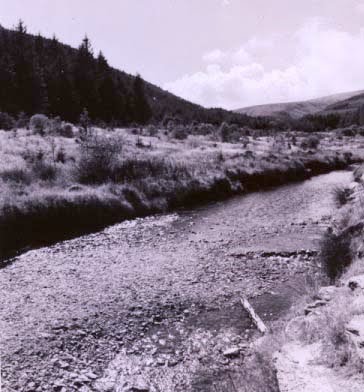
I’m not sure what it is about this picture that I don’t like but I don’t like it, maybe it’s just a bit boring. If you could actually see the stream disappearing off into the distance it might improve it. And once again a lower angle would be good.The background is under-exposed too.


This picture had the potential to be a nicely framed shot but the tree on the right messes it up a bit as does the ridiculously bright patch of grass in the foreground. I do like the hill fading into the mist in the background though. I’m not too sure about the lens flair, I think it would have to be much more exaggerated to look good, lens hood would have been a better option.


This picture is quite nice and spacious that big shadow right across the foreground is a tad annoying, perhaps if I’d come back later in the day it might have gone away. The sky is also lacking a bit of contrast.


What a nice post, not very exiting though.


Quite a nice pretty picture, it might have benefited from a slightly lower angle to exaggerate the hill. The main focus was supposed to be ruin, which is completely lost, but I still think its quite a nice picture.


I do like the great big rock thing in the foreground, its just a bit of a shame that the castle isn’t in focus.


This was a bit of happy accident that occurred because I had two prints of the same picture. I really like the crazy ass distortion that’s going on, I’m not so sure about the leaf though. It could have been better to over expose the shot slightly to make everything glow a bit too.


This was an experiment that I did using double exposure, the look I was going for didn’t really happen because I was layering exposed areas of negatives on others. It has made quite a nice moody picture though and if I where to bung it in Photoshop to darken up the hedge on the right you needn’t know it was a double exposure.


I really like this picture, its nice and abstract thing very moody and quite sinister, very Quayesque (sorry to keep banging on about the Quay brothers). This picture was achieved by simply over-exposing everything. This look is the sort of thing I want for my project, I might have to go off and invent something to put in the set to make nice silhouettes like this.


I would like to think that shooting this reflection of some trees jazzes up what would otherwise be a pretty normal shot of some trees. I quite like it but I’m not sure if the fact that it’s a reflection adds anything to the picture.


Little tree meets big trees. Yet another silhouette I’m afraid, the foreground needs darkening up a bit but apart from that I think it looks ok.


Another experiment with double exposure, which I tried to use to create something, that was a bit abstract. The post is a bit annoying but I think that could be easily Photoshoped out.


This a series of photos that I took round the house one day when I was a bit board. I was doing some experiments with some more extreme camera angles and deliberate over-exposure and I really like the results. This is the kind of look that I want to try and get on my final project.


A quick snap which I think was taken in London. It had the potential to be quite good but the angle is a bit crap, it would have been better if I could have got closer to the wall.

Hate - A force for good?

Well here we are, new term, supposedly ready to leap into production – lets face it this was about as likely to happen as me sprouting an extra head I still hate this project with a passion but I am going to use this as a force for good – in theory at least. And how do I intend to unleash the raw creative potential that only hate can provide? Well, my tried and tested theory is that when I no longer care about the outcome of a project some kind, of creative mind block is removed and ideas flounce out all over the place. Lets take a look at previous examples shall we…

Live at 5: the sports table which everyone liked was produced during a period when I would have rather beat a broadcast journalism student round the head with a blunt instrument than produced for them various flashy graphics, in-fact the sports table was born out of a personal vendetta I was raging against the whole project, a vendetta which failed. Perhaps if I set out to deliberately create the most stupid thing I can I might get something good.

OSTN: a project which started out similar to the pied piper fiasco where nothing seemed to work, so I stopped caring, dispensed with the narrative and threw in a bit of moon walking and ended up with my highest scoring project to date – go figure.

Jesus Just Left Chicago: easily the most creative and least restricted thing I have done in the past year or so. I didn’t necessarily fall out with this one I just didn’t have the time to care in the first place, so none of it was taken seriously and it was cobbled together in an evening.

So what I am proposing is that I do away with the structure imposed by the narrative as that doesn’t seem to help me at all. Instead I will use the animatic I do have to dictate key events which must take place and then improvise the rest of the animation around these events. The real test will be in the editing but if I strip everything down to keep the camera angles and lighting really simple continuity should hopefully not be an issue and everything will hopefully come together at the 11th hour. Failing that I will at least have some nice animated set-pieces for my show-reel.

This week my aim is to get the animatic to a stage where I know exactly what camera angles I need, the actual finished animatic will not resemble the finished product in the slightest as I am using it as a more trial and error sort of thing to work out what looks pretty. I also want a rough idea on timing – obviously a lot of this will be dictated by the final editing but its good to have something to aim towards. For better or worse I want all of this out of the way by the end of the week as next week is dedicated to set-build, then couple of days to ponce about with lights before diving into production I have a schedule- and I mean to stick to it.

Wednesday 6 January 2010

Happy New Year - welcome to the year of the limbless sloth

Happy new years and all that jazz. It’s been a while but I’m back. Apologies for the complete lack of anything recently, the dissertation has more or less taken over my life as of late but the first draft of that is now done and my new year’s resolution is not to do anything else to it for at least a week. And during that week I shall endeavour to get you up to date with all things animationy in my life.

First off I would like to announce that I have decided to merge this blog with the new baby blog, ‘photo phodder’ since I spend most of my time on it referring to stuff that is on this one or repeating stuff I have already written here. Plus it will make this blog look really big and impressive. So over the next couple of days bits of it will appear on here, I will try to edit it down so I’m not talking about things twice but inevitably something will slip through so bare with me.

Right, on to the project, well things are charging forward at the rate of a sloth, which has had all of it’s limbs removed with a spoon, looking for a straw it doesn’t really want in a hypodermic needle stack – I am brimming over with confidence. Quite frankly I think I might be able to make the rate of progress on the robots project look positively lightning fast but no one ever got anywhere with sloth based metaphors so I will pretend all is well and dandy and attempt to come up with something constructive.

I’m pretty much there in terms of knowing how I’m going to animate everything and how I’m going to build the set (specific entries on this soon) but surprise, surprise I still don’t have a proper storey. I was hoping that refusing to look at it over Christmas would mean I would come back with some amazing idea, alas this is not so, if anything I hate the whole concept even more than when I started – hate is not too strong a word I might add. I think at this stage I need to be told to do the storey i’ve got and hope it is better than I think it is or a radical shiny new approach is required. And as I write this the radical new shiny approach is looking favourable.

Rather than focusing on what I don’t have lets look at what I do got. I have characters, a way to animate them and a set, all be it an un-built set but nevertheless a set. I have a look as it where. From animation I’ve done in the past I’ve discovered that my best ideas decide to surface whilst I’m animating, so I’m very tempted to go back to uni, build the set and just start animating, using my half-hearted excuse for an animatic as a starting point only. It’s 50/50 as to whether or not this would work of course, the animation can always be reshot once I know what I want to do. So I guess the only way to fond out is to do it.

Yes, it can be argued that I should have done this sort of thing last term but its to late for should ofs and could ofs and the conventional method of doing things is clearly not working for me. As for the poor little second years that are supposed to work for me and will require meticulously planned storyboards and the like to tell them what to do… well that’s simple, I wont provide them with any. I have decided that I’m not going to have anyone helping with the animation so all I need is someone for sound and maybe some comping and if I don’t have a story by the time I get round to doing that then keeping a second year in the loop will be the least of my worries.