Friday, 25 June 2010

Its been awhile

So much for updating this on a week by week bases eh? It has been a long long time, too long in-fact, so lets have a catch-up. So much has happened, my graduation film is done and dusted, now named Tooty Fluety. I am currently in the process of prepping this for various festivals so for the time being it is staying of of the internet, if it looks like I will not be able to post it I will put together a trailer or something which gives the general gist of things.
Complete with business cards and website (check it out it is very pretty) I have also been unleashed upon the unsuspecting animation industry, as of yet I have no concrete offers for any work, its all ifs and buts but I am hoping the London screening of the gradation films will present some opportunities.
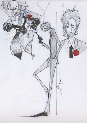
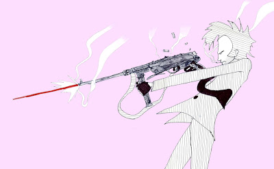
In the meantime, to keep myself busy, and off the dole, I am embarking on a couple of projects. The first of these is my own solo project about a duo of assassins. The whole assassin thing serves as a backdrop to the main story which focuses on one of the pair and his struggle with his sexuality and bipolar disorder. The idea that he starts of as a suave gun-toting homosexual and gradually becomes increasingly unpredictable as the bipolar takes hold and he falls head over heals with his accomplice, who happens to be a girl. So far I have just about got the design down for this hitman bloke, yet to be named. He does look a little like my Jesus character, but i can live with that.
I have tried to work in a lot of the exaggeration I experimented with in life-drawing, so he is quite lanky, which I quite like. In the first set of sketches I was finally starting to get a look down, after a lot of trail and error. I i am hoping that the vertical lines on his body will make make him seen even taller. Most of the pink picture was done in Photoshop, the gun is a tad big and the bottom of the suet bothers me but if I use this concept in the final piece that can be changed.
I am toying with the idea of setting the whole thing in the 60's as the character was influenced quite a lot by Sean Connery's portrayal of James Bond and I have access to a lot of books with pictures of crazy WWII weapons in, the sort of thing which would have been available on the black market at the time. There was also quite a lot going on in the world at this time which I could weave into the story; Cuba, assassination of JFK, fugitive Nazis, the IRA, the civil rights movement, Vietnam, we won the world cup, paranoia over Russia and a world-wide Communist Conspiracy, all kinds of stuff. If I do do this he may get a bit of a 60's makeover, we shall see.

Tuesday, 11 May 2010

Manic

Manic, manic, manic! Quite possibly the only word which can be used to describe the past couple of weeks most definitely what is to come. As of yesterday all the stop-motion is done on Ben?s project, towards the end I was also doing the animation since Ralph was busy doing his rough-cut. I mainly ended up doing the lip-sync scenes which were a tad challenging since I hadn't had the luxury of being able to do any tests so I was acquainting my-self with the character on the fly. The early scenes I shot are a bit ropey but I quickly got used to Helvis and came to discover that slight, understated movements where a lot more effective.

On my project Jake has started to put some sound together, which has had an unbelievable effect on the animation and has really perked it up and help tie the story together. I have currently got two edits on the go, one which is pretty close to the last rough edit and another which is a sort of hybrid of various ideas from Andy and Georg where the piper appears right at the beginning and lures the creatures out of hiding. I was favoring this new edit but now I have seen the old one with sound I?m veering back towards that one again ? this is starting to look like a repeat of my pre-production dilemma so I need to make a decision ASAP and stick with it. In the meantime I plan to be making it all look pretty in Photoshop.

In other news, I have started to design business cards and the website for when I am thrust into the big scary real world. The cards are bit all over the place as I am not really sure what to describe myself as, Georg suggested I just stick my name and contacts on it and then decide what I want to do based on who I am presenting the card to. Once I have a sort of theme going on the cards I will transfer this over to the website, which for the time being is just a URL.

Tuesday, 27 April 2010

Lighting for Ben

Well, what a week I have had. The editing of my project has been neglected somewhat since I have come on board to Ben?s project Aloha as dop, featuring a love sick Elvis meets the Devil, 'Hellvis' character who inhabits a hellish island, see Ben's blog for full details of the project. The lighting side of this is proving to be a lot more fun than my project since I get to play with shadows and filters rather than just creating a sterile white environment. As with my project I?m still using a basic three point set-up; the main light source coming from stage high right as the spot, a softer red light from the bottom left and a gold reflector above the stage provide the fill. The reflector also provides as a bit of a backlight, along with a light positioned behind the stage which is aimed at the backdrop. I am using Deido's to provide most of the light as they can cover a reasonably large area, the LED lights are occasionally bought out to light bits of foliage in the foreground or in some shots light Hellvis from below with an ere red light. I have also put a blue gel in front of the camera, not conventional practice, granted, but it was the result of a happy accident in which I discovered the gel subdued the greens of the jungle props making it look a bit less artificial, it also helps to make the entire thing look like it is set during the night, which it is.
Ben wanted the entire film to be shot in quite a smell depth of field, so I am using a macro lens on the majority of the shots, I have also used a wider angled lens on some shots to show off more the set but with a large aperture to keep a small depth of field. Ben has pretty much given me free reign over how the shots are composed, which is great, and I am really enjoying arranging the scenery to try and give a real depth to the set. I don?t think we will get all of the animation done by Friday but I am going through the storyboard to find similar shots to try and make the shooting schedule as economical as possible so that hopefully we will have broken the back of it. I am also looking to delegate a lot of the post-production on my project allowing me to hopefully do some animation also, fingers-crossed.
On my project, progress has been a bit slower, I do have a new edit and have a big long list of changes recommended by Derrick which I can hopefully implement by the end of the week. Georg did suggest a completely new edit, which I quite like and have had a go at putting it together but I think it would require such a massive re-shoot to keep continuity that I would essentially have to start again.Jake is making a start on the sound and has also volunteered to help out with the editing which will be really good since I am pants at it. Over the coming weeks I am also going to be scooping up any second years who don't look busy enough and persuading them that what they really want to be doing is painting out lots of little lines in Photoshop.

Well there you have it, more next week sports fans!

Monday, 19 April 2010

Rough edit in more detail

As promised I am back with a more detailed look at the rough edit, look,I have even uploaded the video again so you don't have to flick between posts. How kind am I?

Right, here we go then. First off I think I shall talk about the lighting. My approach, from the beginning has been to try and keep things as simple as possible, mainly because I only had four lights to play with. Throughout, I tried to have one main light source coming from stage right and then use reflectors and bounce light as much as possible to try and achieve a rough three-point set up. At some point I discovered I could get some funky shadows by lighting the statues from the top so I introduced some lighting from above also.

I did have some problems getting even lighting, so there are some dark patches and multiple crazy shadows, which in hindsight could have been solved with a Daido but there you go. The whole thing does look a little dark in places, this is because I was using a wide-open aperture on a lot of shots and had to use dim lighting and ND filters to prevent the shot from becoming over-exposed. This can all be brightened up in post...hopefully.

Now, onto some more detail about the shots. The establishing shots where really easy to do, it was just a case of adjusting the focus slightly between frames, the problem with doing this is that the camera is at a huge risk of being nudged every time you touch it and on some of the shots you can see it moving about a bit.

The three shots where the camera is tracking where achieved by dismantling a rostrum and reassembling it so that the camera could move about on it horizontally. This worked really well but the rostrum wasn't very stable and I had to wait about 30 seconds for it to stop shaking before I could shoot a frame, which made for some very long days. In some cases impatience set in and you can see some camera shake, but not too much.

The scenes where the creatures open there mouths where all shot in reverse, simply because I found it easier to animate their mouths closing than opening, this was a little mind bogging at first but I got used to it after a while.

The 2D elements of the shoot where interesting, although they where fairly straightforward and not too mentally demanding to do, since all the animation had been done, technically it was a quite an undertaking to keep everything lined up. This was done very crudely with 20pence pieces etc. as markers, the early attempts at this where a bit rough but towards the end I was getting pretty good at lining stuff up.

Now that I have entered post production I want to have a look at all the animation and remove frames in some places and add others so that it flows a bit better, since each frame is an individual RAW this shouldn't be too hard.

Wednesday, 14 April 2010

Rough edit

It's done, that's right all the animation is finally done. It been a pretty manic couple of weeks, hence the complete lack of blogging activity but somehow I have managed to get my project ahead of schedule for the first time in ever.
Now I am moving on to what is, for me, the hardest and least stimulating part of the project which is all the editing, tweaking and other digital black magic. It, doesn't really help that I have very little experience with all of this but hopefully I can find someone to hold my hand and guide me through it.
Anyway, for the time being I have quite literally thrown all of the rough footage together into a rough edit to get a gist of how the final thing will look. I must warn you that it was only done using low quality AVIs which were bought straight out of the stop-motion software so its all been a bit stretched and there is a load of stuff which needs cropping out of frame. And of course it all needs putting through photoshop to be tarted-up and have all the nastys removed.

So, we start of with these establishing shots which I have gone off a bit. Georg suggested scrapping the whole lot and just using one or two for titles; the focus pulls are a bit jarring and the pace of it is completely off from the rest of the film.
I like the shot of the creature breaking through the poster but the continuity between this shot and the one which it is inter-cut with is a bit off as the poster moves about.
I'm not sure about the aerial shot, there is a bit too much going on for anything to register, if the the quality of the picture is good enough I might try a much closer crop of the action to focus the viewers attention on the sleeping character.
Again, there is another problem with the viewer registering what is going on when one of the creatures rocks up to eat. The 'rape' scene before might break up the flow a bit too much and i am not sure if it is clear that the montage of creatures eating is supposed to be separate creatures.
I desperately want to re shoot the scene where we first see the piper because the framing is pants, the animation isn't great either but that could be fixed by repeating a few frames hear and there.
The next section, with the piper producing and playing the flute and the creatures reacting, works quite well. There is enough time for the viewer to register everything in frame since the shot is repeated quite a lot and I would like to think that the timing for the creatures starting to bob about is about right to achieve maximum comic effect.
The walking scene is funny but a bit short, so i might inter cut it with the boob bounce shot to extend it a bit. This might jolt a bit with continuity but if you watch the statues in all the shots they are never in the right place anyway.
Well thats about it, obviously the whole thing is in dire need of some proper editing but on the whole I don't think its too bad; it seems to be generating the laughs in the right places at least. At some point I will go through each shot and talk about how it was animated and the lighting and all that jazz, there you go, something to look forward too.

Tuesday, 30 March 2010

Rushes and things

Ok, I know I have been neglecting the blog as of late, so to make it up I have all of my animation from the past two weeks, of which there is a lot. I'm afraid its not in any particular order so don't worry about narrative, just flick through and I will provide commentary where appropriate.
There are lots of little changes I plan to make in the edit, such as holding the odd frame and cutting others out but hopefully the general gist of the movement is there.
Oooo, and just a note, these vids have all been pulled straight out of stop-motion pro so they are all stretched, not cropped right, in need of colour correction etc. and are just generally of crappy quality - enjoy!


Now, shot 25 (below) is an interesting shot, this is the one where the angry little creatures charge forward. It was unbelievably difficult and took me the best part of a day to figure out with the finished result being this funny little bounce they do. I'm in two minds as to whether or not I should go back and re-do this as it would be relativity easy to add a bit more movement and smooth it up a bit, but the jumpiness of it mimics the pipers movement quite nicely so I want to see how it looks edited together with footage of the piper. It might also look a bit different once the rigs are painted out.


I did this shot (below) today and I think its a bit iffy, the lighting is very ropey and the piper is completely cropped out in places so the tiny bit of movement you do see is very jumpy and not on screen long enough for the viewer to register. It might work in the final edit but I think I may have to re-shoot this one.


Well there you have it, all the plastercine animation, this week im on to 2D, Lee is coming onto the project to do some inking so hopefully I can get the bulk of it out of the way by Easter weekend, whack out a rough edit and work out what needs re-shooting. Yay!!!!!

Sunday, 14 March 2010

Video Tweaks and Things

I was going to post a video or two of some tweaked animation but I can not get Premiere to behave, so we shall have to make do with the clip from my last blog and a couple of stills instead.
What we have in the aforementioned clip is a very rough edit together of two shots where the creatures burst through the poster and jump out. To film the track-in, assisted by Georg, I had to rig up the camera on a dismantled rostrum, allowing me to move it backwards and forwards in small increments. On this set-up the camera could be treated as any other animated object would be. Originally I animated the track on twos but this looked awful so I did it on ones instead and it came out a lot smoother. I did manage to mess up the focus pull though so everything goes a bit out of focus half-way through but I quite like it and if I cut out the bit at the beginning where the poster is in focus it would look intentional.
During the course of animating I improvised the scene with the smaller creature pushing the fluff onto the larger one; the characters where starting to develop their own personalities as I worked so i just went with it,I think is works quite nicely. There are some bits which might benefit from an extra frame hold here and there, just to make it all a bit less rushed, which is easy enough to do. There are also a few bits and bobs which may want masking out and maybe a frame adding of the bigger creature leaping from the hole as at the moment it jumps a tad too quickly. All in all though, for my first attempt at stop-mo since last term I don't think it is too bad.

Now for the really techy stuff! In the clip in the last post what you are seeing is an image which has been stretched to fit the widescreen format, stop-motion pro seems to feel a need to do this which is a tad annoying, obviously this is not what I want the film to look like. To fix this I am going to have to take the RAW files from the SLR, which stop-motion pro doesn't touch, and crop them down to fit widescreen, This means that I am shooting a lot more stuff than is actually seen, and have to be careful that all the animation will fit and not get cropped out. Although the clip has been stretched I have cropped it down to try and simulate what the finished article will look like.
Originally I wanted to shoot the entire film so that everything was overexposed and glowing. This is still my intention but I am now going to apply this effect in post because it is easier to perform any digital fixes if the colors are not bleeding into each other.
For the time being I have just messed around with cropping, the exposure, contrast and saturation on some stills and I quite like the results but I might also have a play with filters to adjust the color temp, we shall see.

Thursday, 11 March 2010

Rough edit

Here we have a VERY ROUGH edit of some scenes I animated this week. It is all a bit fast and the video quality is a bit crap but hopefully it gives the gist of what I want to achieve. I also want to take the whole thing into photoshop and mess with the exposure etc. to make it look pretty, will do some tests with it this weekend.

Sunday, 7 March 2010

Quick Update

Thought I would just write a quick little update to keep you all abreast of where I am at on my project and perhaps more importantly where I should be at. This week I have been busy building the two sets, they are both in the same setting, except one makes use of forced perspective and the other is specifically for a zoom shot on the poster. I will post some more detailed notes on this later in the week. There have been a few teething problems, such as the paper I was using to coat the entire thing not sticking properly, which has delayed things slightly. As a result of this the forced perspective set still needs some odds and ends finishing up on it but the set for the zoom is all done and ready.
Since I am scheduled to start shooting tomorrow I will crack on and do as much as I can with what I have got but I only have the stop-motion stage for the one day so it is going to be a long day. That said, there are only two shots that require the use of the zoom set, so fingers crossed I might be able to do that in a day.
The fact that I am unable to use the stage for the rest of the week is probably a blessing as I still need to finish off the second set. I am also hoping that Holly can get the statues finished off and done too...production of these has been a bit slow but there have been lots of stressed second years about lately so I have kept out of the way, the set is not yet ready for them anyway.
The 2D stuff will hopefully be done and dusted this week, I know I say this every week, Sara has had all the stuff that needs tweening for the best part of the week now, so hopefully I can get my hands on that this week and start inking and cutting out in the evenings, as I need it, allowing me to animate during the day - thats the plan anyway.

Tuesday, 2 March 2010

Development of the Piper Character

We have finally made it! Yes that’s right, I’m going to explain the development of the piper character, hard to believe it I know but I have actually managed to find time to talk about her.

She has been through three different stages of development:

As I have mentioned umpteen times my final project has its roots in a project which we where assigned in the first year. Back then she was completely different to how she is now and was a very Aardman inspired sort of character with a very caricatured sort of look. Here are some sketches of her which I did back in second year when the storey was still about a crazy old lady who threw puppies in a river. I’m quite found of this design and I think it would fit in well with the storey which I am now using but she would have been a pain to animate in 2D and near impossible for me to construct for stop-motion.


Over the summer the story changed quite drastically into a poncy arty thing and so did the piper. She became very scribbly and free flowing, allowing her to pull off quite a large range of poses. This new style emerged out of my default scribble drawings which I usually revert to when I’m messing about with an idea and a desire to keep things as simple as possible. I definitely knew that I wanted to do stop-motion but after the Robots project I was very wary of puppets and was instead aiming for something which I envisaged could just be maid out of a big blob of plastercine.
She was originally going to be really sinister and evil too, essentially the previous version of the character with all the funny removed.

After the summer the story was changed around quite a bit but the piper remained pretty much the same until the end of the last term. Visually she has not changed too much but the nature of the character has changed quite a lot. The storey has had a lot more humor injected back into it and the piper is a lot more like she was originally. She does have sinister motives but she is also funny, Visually, she still has a big blobby body which stretches about quite a lot but there has been the addition of a feathered hat, since that is the sort of thing a imagine a piper would ware and for comedy value she has a very well developed set of boobies, courtesy of Holly and Georg.


Note: Blogger doesn't want to behave this evening and is refusing to upload any more picture, hopefully it will decide to play tomorrow,

Monday, 1 March 2010

Progress!

So much stuff has happened to my project in the past week I’m not really sure where to start, I guess a good place to start is the addition of some second years to my endeavor. I am very happy with my team, I must admit that I was slightly unprepared for the sheer amount of enthusiasm they have all displayed despite my rather useless attempt to explain what the project is about, it was a bit of a bumbled effort to brief them all but I am back in my comfort zone now that everyone seems to know what is going on. My second years are Sara, Holly and Jacob. Sara seems to be somehow deciphering the key frames I have produced for the 2D stuff and what I have seen looks very good and the bulk of it will hopefully be done by the end of the week, which by my standards is ridiculously fast. Holly is busy sculpting the erotic statues, which are going to be on the set which look suitably rude and make everyone giggle. Although she hates to admit it I think Holly is quite enjoying modeling engorged penises. Jacob is responsible for sorting out my sound and I have given him a big long wish list of Foley sounds I would like, so I will hopefully get some of those in couple of weeks.

With the second years doing all the important jobs I have gone out and bought a saw and some wood. Since I was feeling especially productive I have even cut up the wood and thrown a lot of nails and glue at it in an attempt to build the set. My GCSE in product design has obviously served me well, as despite the set being of a build quality which closely resembles Cherie Blair’s face the thing is yet to fall apart and that is an accomplishment in my book. There are still one or two issues with the paper covering on it not sticking properly but I will deal with that tomorrow by using more glue and a creative interpretation of the English language.

I have also tweaked the poster (in my post last week) slightly by moving the nasty creature a whole inch to the left. Before it was a bit floaty and the whole poster was a bit unbalanced, now I think it looks a bit better. My hope is that the red and black will stand out against the white set and really grab the viewers attention but we shall see.

The grand plan is to get most of the major parts of the set build done by tomorrow so that I can help Sara out with any tweaning on the 2D which remains and also make a start and the inking and then with any luck start churning out some animation next week – famous last words.

Thursday, 25 February 2010

Some more Stuff

Just another bit of work I have got done this evening; the dead body which my creatures will be eating.

Wednesday, 24 February 2010

Poster Design

Just a quickie to show you all the design for the poster which will be on the set:


Since i'm going for this pristine look I have essentially ripped off the design for a 2007 exhibition at the met on Bauhaus design, seen here: . I'm hoping the red in my version will help to attract the viewers attention but we shall see. More on this later.

Tuesday, 23 February 2010

Some line-tests

This summary is not available. Please click here to view the post.

Tuesday, 16 February 2010

A jolly Good Update

I’m back!!!!! Yes I know its been a while but never fear for I am here. As of late the blog has died a bit of a death due to the big nasty scary dissertation deadline looming but that is now all finished and done so hopefully I will be able to find time to keep you updated on animation going ons at least once a week…maybe even more often!

Right, if I remember correctly, I was on the cusp of explaining the development of the piper character in my final project, this I will put off a bit longer as for the time being I think a jolly good update is in order.

So where am I at? Well I am successfully forging my own path to doom by treating most of the advice I am getting as ‘optional’ and hence I am going into production with only the slightest inkling of what I’m going to out with at the other end. I appreciate that this is not the most professional way to go about making a film, especially one on which so much of the rest of my life relies but planning stuff out like a good little boy wasn’t working. I do have an animatic, storyboard and shot plan but I am treating these more as suggestions of what should happen – I know how most shots are starting and ending but not necessarily what goes on in the middle…always fun.

As for the production itself I am well into the 2D animation which is supposed to be finished by the end of the week. I am a bit skeptical about this imposed deadline mainly because I thought I was going to be getting a ‘2D animation assistant’ this week, it turns out that I don’t get assigned someone till Friday, ho-hum. The actual animation is going quite well, apart from a few teething troubles early on I’m churning it out at a reasonable rate at a standard I’m happy with. As a result of my dirty mind and the sniffing of too many permanent markers the whole animation is becoming a bit of sexual farce with bouncing cleavage and suggestively shaped flutes galore but it makes people laugh and I think I’d rather have something which was funny and didn’t make sense to a film which is over analyzed and wooden.

Anyhoo, I will give a bit more of an in depth look into the animation in the next couple of days.

Thursday, 14 January 2010

The Creatures

The time is finally here! Yes, I am going to talk about the development of my characters – I can hardly believe it myself. Today I think I shall talk about the development of the ‘creatures’ as they are now known, mainly because I am feeling a bit lazy today and I have lots of videos that I can show you rather than describing everything.


Here we go then, I am sure I have mentioned on numerous occasion the origins of this project but just for kicks I will go through it again. Way back when in the first year we did a project with Kathy where we where given a poem which we where supposed to turn into a storyboard. My poem was The Dog by Ogden Nash, which was basically all about how wonderful dogs are – until I got my hands on it that is. I successfully turned it into a delightful ode to sexism, ageism and animal cruelty in which a crazy old lady who threw puppies in a river. After completion this project was promptly forgotten about until it was unearthed last year as something to play with in my spare time. I didn’t really touch the storey but instead focused on character development – here are some quick doodles I did. Although a long way off from the final design I was still going for that cutsie roleypoley look.


Over the summer these characters where significantly simplified and stylized into blobs with tails. This clip shows an early prototype which I gave eyes and a brow as both Derek and Andy suggested this would give them a bit more expression.


Last term I also spent a lot of time experimenting with different types of armatures for the creatures. Originally I intended for them to be made of solid plastercine with wire for the tail but this just fell apart during animation. Through trial and error and a lot of help from Georg I found that the best method of construction was to sculpt the plastercine around a Styrofoam body in which the wire tail was mounted. I also used a bit of wirte for a neck joint. The problem that I found with this was that the movement was quite restricted and wooden, as these tests show. However, I did like the weired glide effect that could be achieved by shooting everything on ones.


The other problem which is blatantly obvious is the dead expressions, tis was remedied with some nice big beads which gave the characters a good puppy eye look. At one point I was also toying with using replaceable heads to try and get some emotion into the characters. Georg lent me some Nightmare Before Christmas toys to have a play with. It worked quite well but I came the conclusion that i didn't fancy building umpteen heads for my horde of little creatures.

I can't remember if it was my idea or somebody else's (probably the latter) to change the shape of the characters to try and work in a bit more movement and loveability. Regardless, the general idea was to simplify everything to make it as easy as possible to animate. I ended up with the wonderful blob, here is the moment i discovered it. I then spent the rest of my time playing with the blob to work out the best way to animate it, the best examples of which can be seen in the design bible, everything else can be viewed at:http://www.youtube.com/user/ShadyJoe47 .

Tuesday, 12 January 2010

Design Bible Explained


Back again! In case you hadn’t guessed yet I’m having a bit of a blogtastic week. Today I’m going to revisit and explain my design bible which was rather hastily posted at the beginning of December so Andy could see it. I’m reposting it here to save you having to find the old post because the kind of nice considerate person I am.

I will be honest, the bible was cobbled together at the last minute and became more of an exercise in editing together bits of artwork and footage rather than explaining anything, but nevertheless it does occasionally hint at bits of information that might be useful to any perspective lakies I happen to stumble across. Since I have now resolved to not use any extra help, apart for sound design and comping the bible is pretty useless but it does sort of illustrate what I want to do and how I am going to do it, I think.

The title for my epic: Boobs and Violence is a working title but is sums up the content and my general “if I’m going to fail I’m going to fail as spectacularly as possible” attitude, so I might keep it.

First in the bible we encounter the animatic, this has since been edited and now flows a bit better but the basic storey line remains pretty much the same. (The changes I have made will be discussed at greater detail in a later post). I’m going to deliberately keep what happens in the animatic pretty open to allow as much scope as possible for improvisation. As of yet there is no scratch track – Georg has kindly offered to play penny whistle for me, my plan is to use this as foley for the piper and as a backing track in some other sections. The rest of the sounds will just be provided by foley.

Right, the creatures have developed from puppy like things to happy little blobs with teeth. A more detailed account of their development will be posted soon, for the time being I am going to talk about animating them. When I first started animating them I found that after a while they would start to develop a head, which although it looks nice is a right pain to re-sculpt. To solve this the model just needs to be picked up occasionally and re-rolled into a ball, you can get away with an amazing amount of jumps from one pose to the next, so its not too difficult to re-position them it on set and it be noticed.

The eyes are very, very important, infact, most of the character’s expression comes from the eyes and very limited movement of the body. One thing I didn’t mention in the bible was that the eyes do have a tendency to move up the body till they sit on top of the head, this is BAD AND WRONG as you can then see through them. This can be avoided by keeping the eyes roughly central on the blob. And of course we have the beauty of the blob, quite possibly the nicest thing to animate ever. If the model gets into a bit of a dodgey looking pose it can simply be re-rolled into a blob and allowed to roll away, consider it a get out of jail free card.

And so we move onto the piper herself. The key with this character it to exaggerate everything, nothing is subtle; the bigger and more whacked-out looking the pose the better. She also has various aspects such as her fingers and the feather in her hat, which trail behind her and generally flop about a lot, hopefully making her look a bit uncoordinated. And of course we have he most rather ample assets, courtesy of Holly and Georg, these are going to have minds of there own and are going to bounce around all over the place. I think I need to do a lot of in depth research into this in order to get a good realistic bounce.

Then there is the set, it is currently mocked-up out of card and I’m happy with the dimensions and the forced perspective look I was going for. The rough layout is going to be constructed out of foam board, and then I will just stick random stuff on it till it looks right.

Monday, 11 January 2010

life-drawing


I’m going to talk about some life-drawing stuff. The reason for this is that I have been experimenting with some exaggeration and shading techniques that I think could be quite useful for my final project. So here we go then...first up we have an example of my first attempt at some deliberate exaggeration; by making anything at eye-level really big and everything else really small. Unfortunately the models groin seemed to constantly be at eye level (thats my excuse and I'm sticking to it) so I have ended up with some rather suspect looking drawings.I quite like this sketch but I think the legs need to be tapered in a tad and maybe a bit smaller.

Despite the slightly disturbing 'Come hither' look in the model's eyes and the general nature of the pose, this is one of my favorite drawings, mainly because the amount of exaggeration and foreshortening is absolutely ridiculous. His arms are a bit iffy but I think all in all its not a bad attempt.
I do like this fish-eye type look that this technique gives my drawings and I think I will stick with it for a while and I want to try and incorporate it into my final project-maybe through some jiggery-pokery with the set design or the use of a fish-eye lens. However, I am not sure at what point this would cease to look interesting and just become really annoying.

For a while now I have been having a bit of a think about what sort of lighting I want to use on my project and I have been doing some experiments in life-drawing with just drawing the negative space around the subject. This gives a really nice strong silhouette and stops the subject fading into the background which is a problem I sometimes have. This could be a risk when I come to light my set so strong back lighting could be useful. I have found that if I put too much detail on the subject
everything can become a bit lost so I may have to do some tests to make sure you can still see what is going on.


A prime example of this can be seen in these sketches I did the other day; the head is fine as there is relatively little shading but the body fades away a little too much for my liking. I suppose it could be quite nice if you wanted something lurking in the shadows or stuff along those lines though.

Some camera ideas

Right, today I’m going to discuss what sort of ‘look’, in terms of lighting and photography that I want to try and achieve on my final project.

Aperture

The main idea that I have always run with is that I want to use a ridiculously small depth of field. This has mainly been inspired by watching too many Quay brother’s films; where your always catching glimpses of things moving about but there all out of focus so you are not sure what is going on. In an interview with Nick Wadley, in his essay Masks, Music And Dances of Dream, in the book Pix 2 the Quay’s talk about how they shot Rehearsals for Extinct Anatomies (1987) using a wide angle lens with the aperture “wide open” so that the set would drift “off into infinity”. They also deliberately over-exposed everything to give it a luminous effect.
I have done some tests with this and you get some nice effects with objects moving in and out of focus as you animate. You can also get some beautiful things going on with focus pulls; especially if you use a wide-angle lens since there is a bit of distortion. I’m not sure if I want to over-expose anything though, obviously I need to do some tests when the set is built but I think it could be just a little bit overpowering, plus I don’t want the entire film to look like I just stole it off the Quay’s and it might clash with the trap-dooresque feel I’m going for with the storey and character design.
Even if I don’t deliberately over-expose, it will still be a problem because of the wide-open aperture that I want to use. This can be overcome by getting a neutral-density filter for the camera or putting some sheets over the lights, which is a lot cheaper because I can nab them from the media store so it is free. I would have to do some tests to get the right grade but that shouldn’t be too difficult when I decide what kind of exposure I want.
If worse comes to the worse I can always deal with this in post since I will be shooting using RAW’s but I’d rather get it right now to avoid extra work later on.

Lenses


As I mentioned earlier a wide-angle lens gives some nice effects when pulling focus. I want to use a wide angle on my establishing shots or anything that sows a lot of the set. For the anything else I think I will use a lens with a long focal length to avoid too much distracting detail and provide better framing of the subject. Plus it will allow me to position the camera further away from the set, giving me more space to animate but it will make the whole scene appear flatter, hopefully the small depth of field will hide this.
I’m also toying with the idea of using a fish-eye lens, I don’t know how I will get my hands on one, I assume they have them in the photography store, and I don’t know if you can get them in different focal lengths. Since I am using quite a lot of forced perspective on my set anyway this might be just too much for the viewer to take in but its worth a try to see what it would look like.

Filters


I think it was when I was first discussing my storyboards for this project that I mentioned I wanted to make a filter to create a ‘through the key-hole’ type look to the film. Since then I have seen this effect in a lot of stuff on the telly and in the odd film, so I need to find out what this filter is called and see if I can find one.
Georg has shown me a filter that creates a really cheesy starburst type effect on light sources, which I naturally think is the greatest thing ever. I can’t remember what the filter is called but I will probably bee using it. I’m resisting the urge to go all Top Gear with graduated filters as cool as they are, mainly because I think it will be too much to visually take in, especially with the way I am now going to animate my main character but if I have some spare time I might have a play with some filters to see what the set would look like.

Lighting

After the Talking Dog project, which was a bit of a baptism of fire, I have decided that the best thing to do with the lighting for my final project is to have roughly the same set-up for every shot. This will hopefully speed up production considerably and provide a bit of continuity; so much time was spent sorting out the lighting for talking dog, as each shot was lit separately, which when you have forty odd shots gets a bit ridiculous. The need may arise for a specific lighting effect on certain shots in which case I can jiggle with the set-up a bit but I am hoping that with sufficient planning I will only have to set-up the lights once.

So what sort of lighting am I going to use? A very good question. This slideshow of some of my concept art shows how my ideas have changed throughout the project: Initially I wanted the whole thing to look quite dark and dingy…lots of hard light, silhouettes, fast fall-off etc. Since deciding to change the entire set so that it is white, essentially making it one giant reflector, everything has got a lot brighter and sparse looking. The last two drawings show the current idea that I am going with; in the first the lighting is perhaps a bit too harsh but the second, showing the statues in more detail shows a softer light, which I prefer.

And how do I intend to achieve this? Well, I’m probably going to keep things as simple as possible and stick to a rough three-point lighting system, although I’m not a big fan of back lights; I don’t like the whole glowing outlines look. From just messing around with some lights in the studio I have found that you can do a surprising amount with just one light and a couple of well placed reflectors. These photos where all shot with just a sidelight and two reflectors, one on the other side of the subject and the other behind and just above the camera. The background I’ve used also acts as a reflector, which is one reason why I made my set white because I like the contrast between background and subject. If I do shoot with the aperture wide-open I will have to be careful that the whole thing doesn’t wash-out though.

Photos from my Shady past

I thought it would be a bit of a giggle to have a look at some photos I’ve taken for previous projects and in my spare time, mainly to see if there is anything I can learn from them that can be applied to my current project but also because I though it was about time I put some actual photographs on it.

All of these photos are either shot on my trusty Canon T-70 or Pentax K1000 using a wide-angle lens or a zoom, off the top of my head I’m not sure about the focal lengths. Some have been tweaked a little in Photoshop to improve contrast and remove the odd scratch but that’s the extent of any digital meddling. These where also all shot on film, most developed by the lovely people at Boots but I did develop some myself and where I did I often used a purple filter to improve the contrast.

So, here we have a lovely picture of a burnt out car in a field, this passes for fun with all the cool cats in my neck of the woods. Lets have a look at it then, well I took it because I liked the contrast between the manky car and its surroundings, a bit cliché perhaps but ho-hum. The horizon line is quite nicely placed in the lower third of the picture, making the car look nice and insignificant, like it was part of the surroundings.
I do have an annoying habit of just standing there when I take a picture, mainly because I get a bit snap-happy and I have another annoying habit of finding myself in the middle of nowhere when I go off taking pictures and don’t fancy straddling a load of barbed-wire to get the perfect angle, I am trying to be more brave though. I think the picture could have benefited from being shot from a slightly lower angle to make it that bit more interesting.

Here are some pretty ferns, not a practically challenging picture to take but it was a right pain to keep my feet out of the picture. The original was lacking a bit in contrast which I later tweaked digitally but if I’d been thinking on the day I could have used a filter to jazz it up a bit.


Not a bad picture, the tree on the left is bit annoying and if I’d taken it from a lower angle I could have got rid of that hill which messes up the silhouette. There is a bit of a silhouette theme going on because some of these pictures where taken on a particularly sunny day and I didn’t have a polarizing filter, so I went silhouette hunting instead.


Ooo, crazy over-exposure and I don’t know what was going on with the framing. I do quite like the over-exposure bit though, especially where the tree at the back fades off into the shadow. Something like this in my project would be quite nice.


I’m not sure what it is about this picture that I don’t like but I don’t like it, maybe it’s just a bit boring. If you could actually see the stream disappearing off into the distance it might improve it. And once again a lower angle would be good.The background is under-exposed too.


This picture had the potential to be a nicely framed shot but the tree on the right messes it up a bit as does the ridiculously bright patch of grass in the foreground. I do like the hill fading into the mist in the background though. I’m not too sure about the lens flair, I think it would have to be much more exaggerated to look good, lens hood would have been a better option.


This picture is quite nice and spacious that big shadow right across the foreground is a tad annoying, perhaps if I’d come back later in the day it might have gone away. The sky is also lacking a bit of contrast.


What a nice post, not very exiting though.


Quite a nice pretty picture, it might have benefited from a slightly lower angle to exaggerate the hill. The main focus was supposed to be ruin, which is completely lost, but I still think its quite a nice picture.


I do like the great big rock thing in the foreground, its just a bit of a shame that the castle isn’t in focus.


This was a bit of happy accident that occurred because I had two prints of the same picture. I really like the crazy ass distortion that’s going on, I’m not so sure about the leaf though. It could have been better to over expose the shot slightly to make everything glow a bit too.


This was an experiment that I did using double exposure, the look I was going for didn’t really happen because I was layering exposed areas of negatives on others. It has made quite a nice moody picture though and if I where to bung it in Photoshop to darken up the hedge on the right you needn’t know it was a double exposure.


I really like this picture, its nice and abstract thing very moody and quite sinister, very Quayesque (sorry to keep banging on about the Quay brothers). This picture was achieved by simply over-exposing everything. This look is the sort of thing I want for my project, I might have to go off and invent something to put in the set to make nice silhouettes like this.


I would like to think that shooting this reflection of some trees jazzes up what would otherwise be a pretty normal shot of some trees. I quite like it but I’m not sure if the fact that it’s a reflection adds anything to the picture.


Little tree meets big trees. Yet another silhouette I’m afraid, the foreground needs darkening up a bit but apart from that I think it looks ok.


Another experiment with double exposure, which I tried to use to create something, that was a bit abstract. The post is a bit annoying but I think that could be easily Photoshoped out.


This a series of photos that I took round the house one day when I was a bit board. I was doing some experiments with some more extreme camera angles and deliberate over-exposure and I really like the results. This is the kind of look that I want to try and get on my final project.


A quick snap which I think was taken in London. It had the potential to be quite good but the angle is a bit crap, it would have been better if I could have got closer to the wall.